A new season called for a refreshed social media look. While preparing for the 2026 season, I identified an opportunity to further explore the “space” narrative embedded within the Rocket City Trash Pandas’ brand, and despite the team’s six-year history, had not yet been fully utilized.
The creative direction draws heavily from mid-century modern graphic design, particularly the work of Saul Bass, as well as iconic visual language from classic science-fiction cinema, including “Star Trek” and “2001: A Space Odyssey”. These references helped me implement the use of bold composition, simplified shapes, and negative space throughout.
A new branded element introduced this season is what I refer to as, “Sprocket Camo.” Sprocket, the Trash Pandas’ mascot, appears throughout official MiLB logos and this motif became the foundation for a custom pattern. By manipulating the Sprocket logo through scale, color, and depth, I created a camo-inspired texture that adds visual interest while remaining uniquely tied to the brand.
The color palette is anchored by red and black, a high-contrast pairing that enhances legibility and reinforces the futuristic, space-aesthetic. Minimal texture treatments and scattered star elements were used to add dimension without overwhelming the content.
This system was designed to be flexible and instantly recognizable across all platforms, strengthening brand consistency while pushing the Rocket City Trash Pandas’ visual identity into a more cinematic, space-driven direction.
2026 RCTP Creative Direction
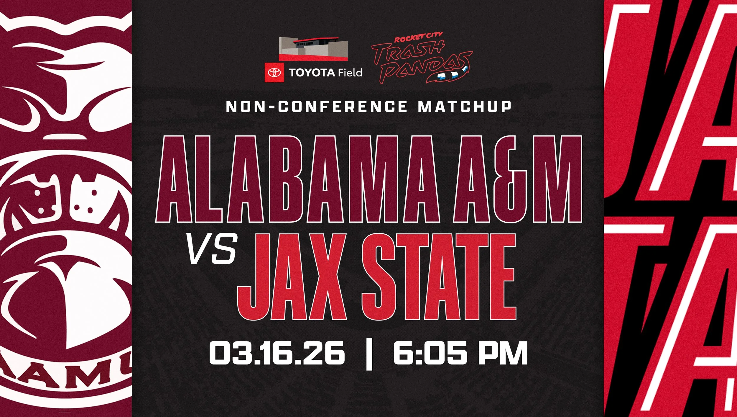
Social Templates
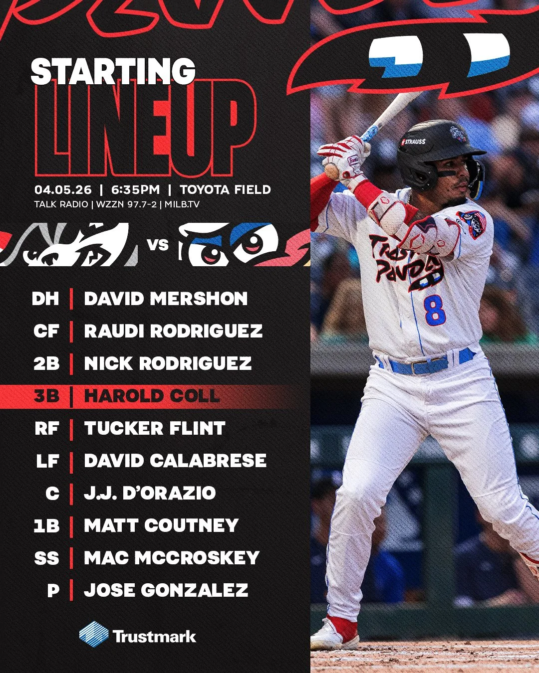
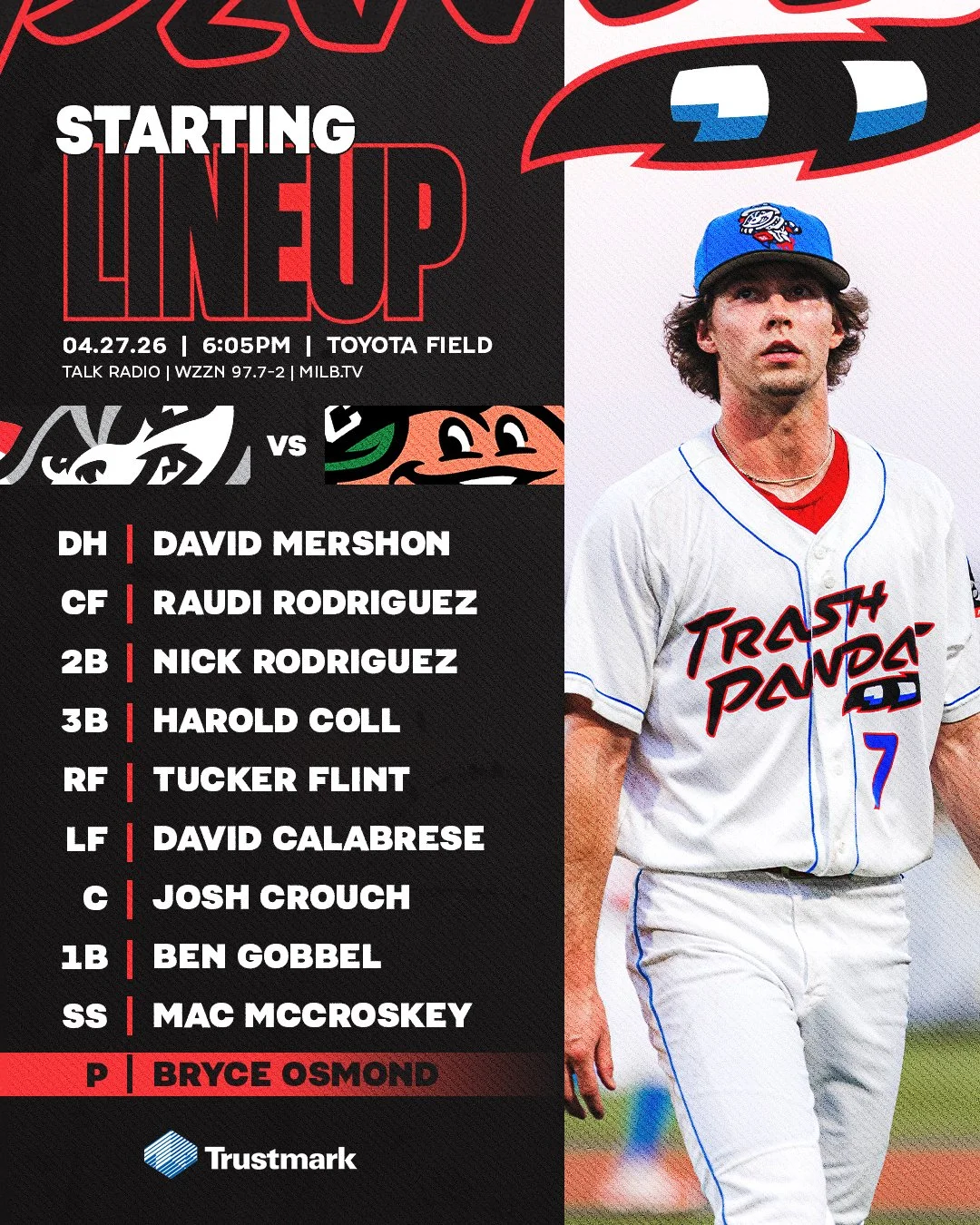
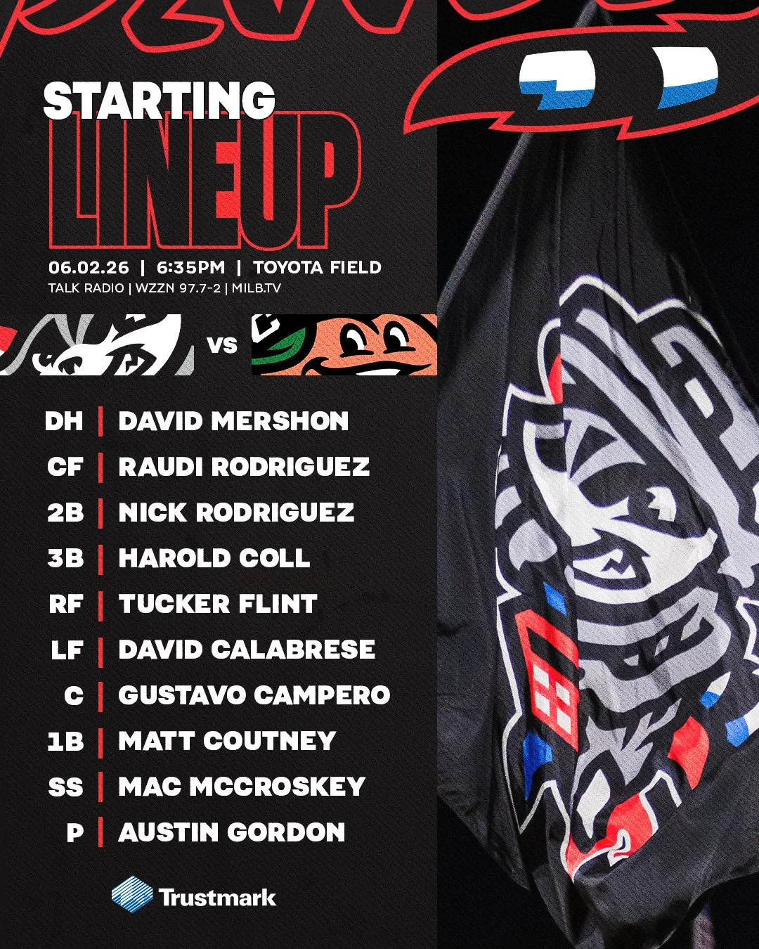
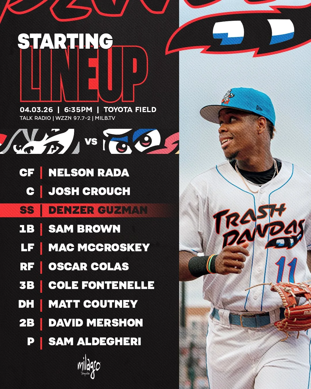
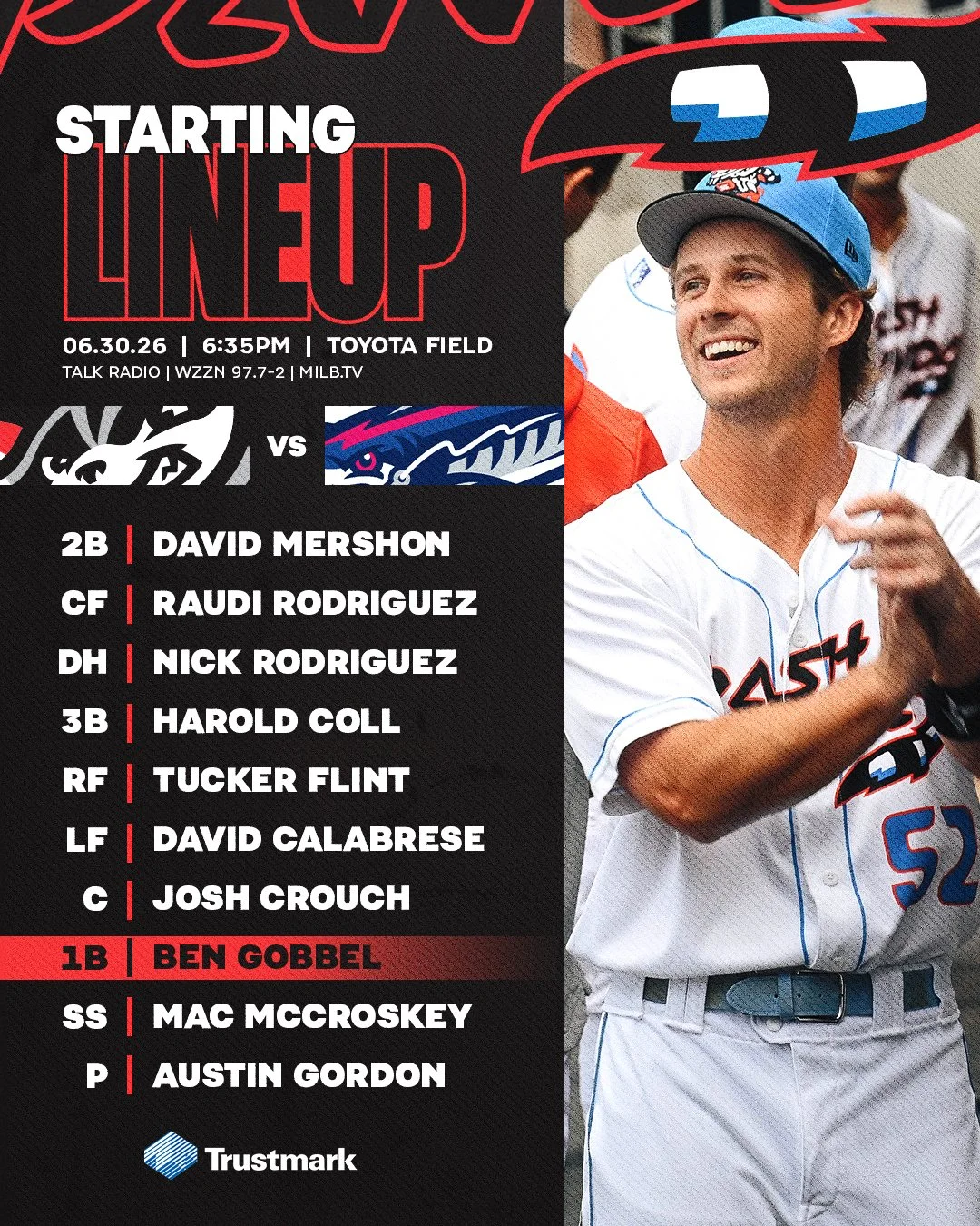
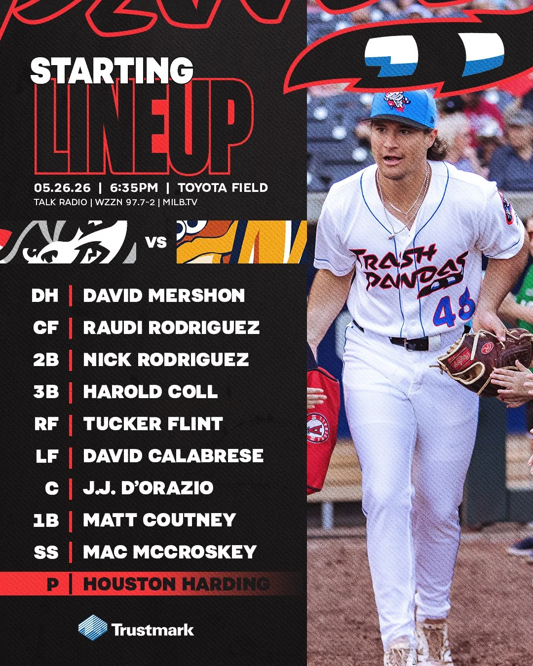
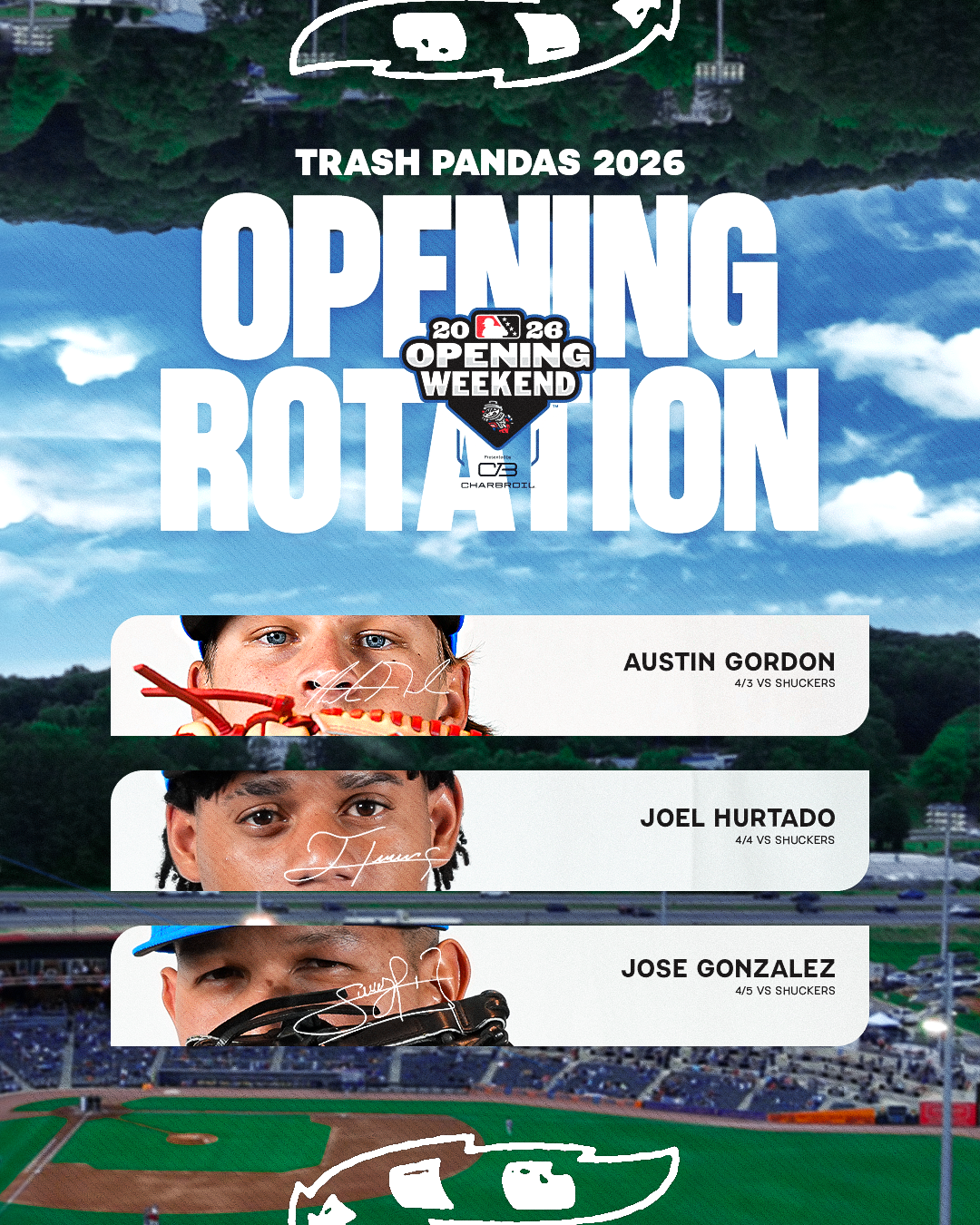
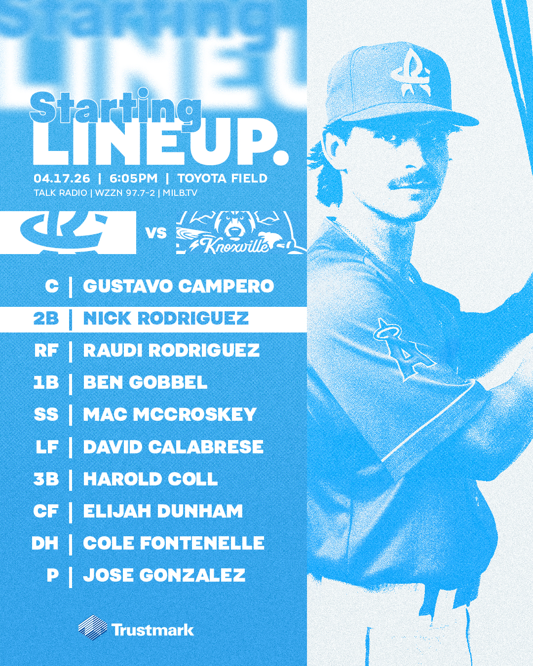
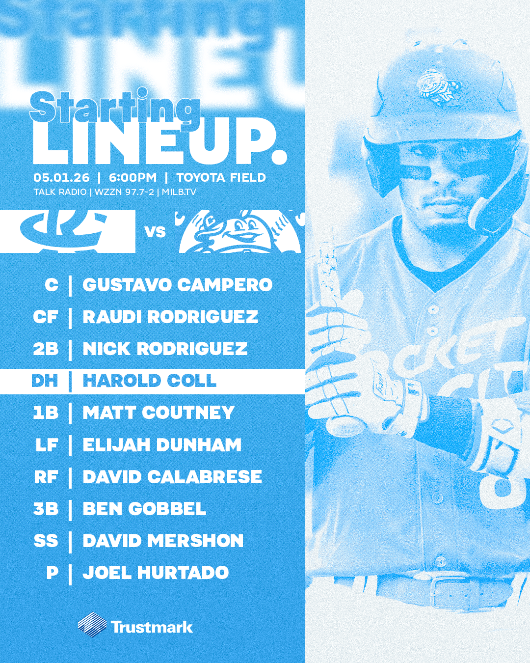
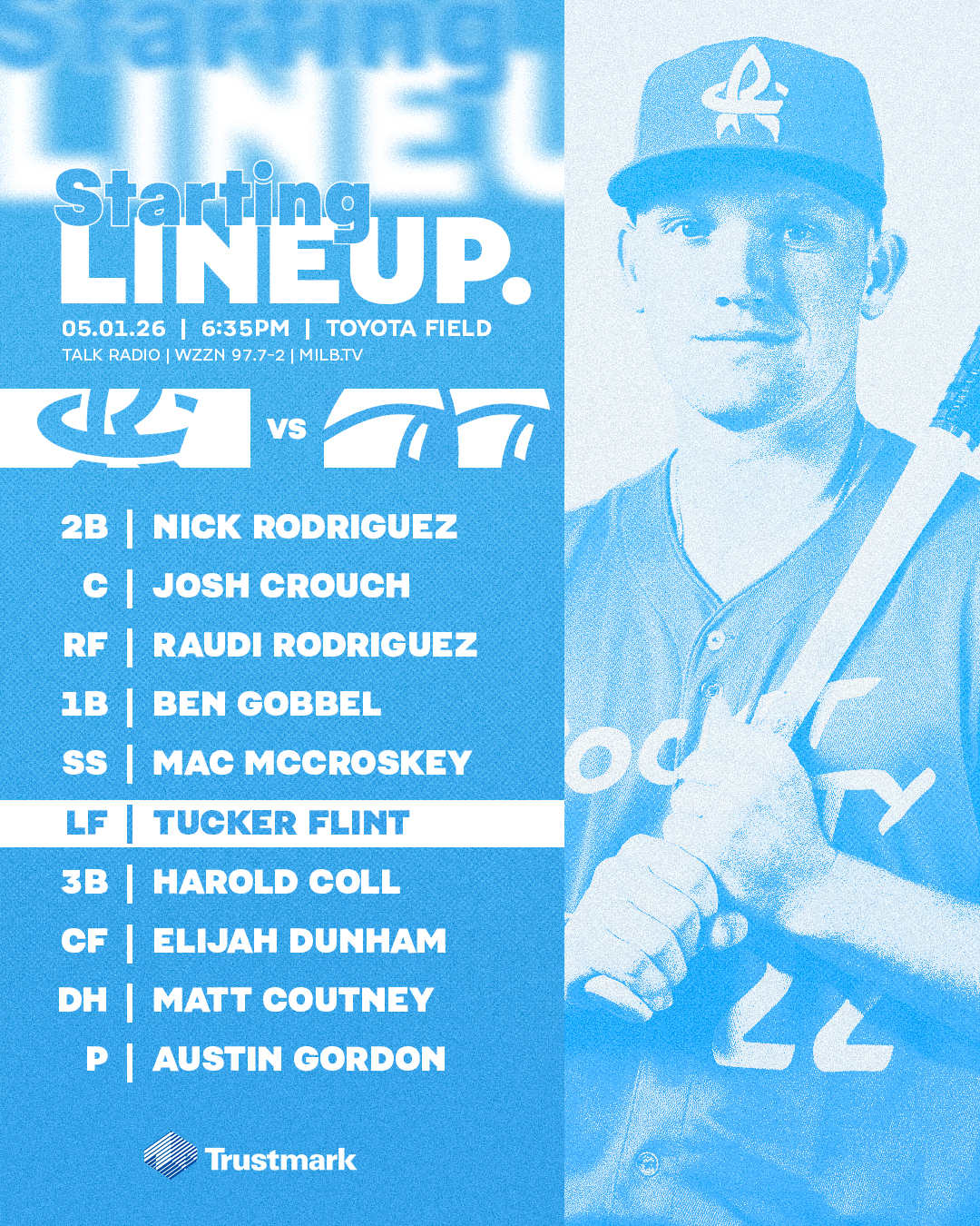
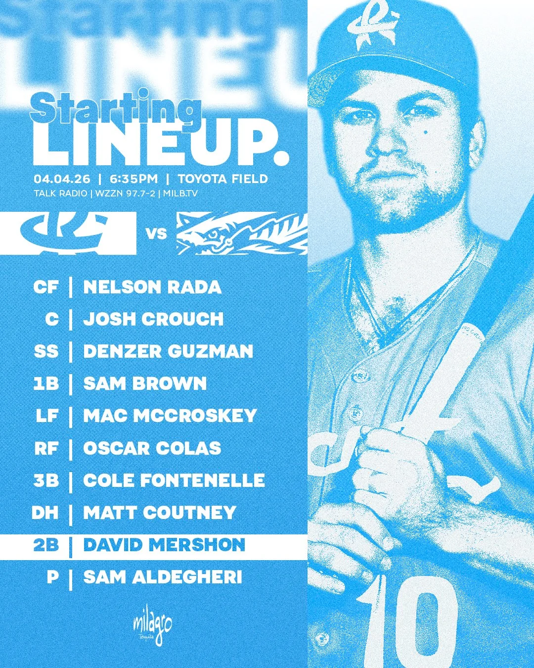
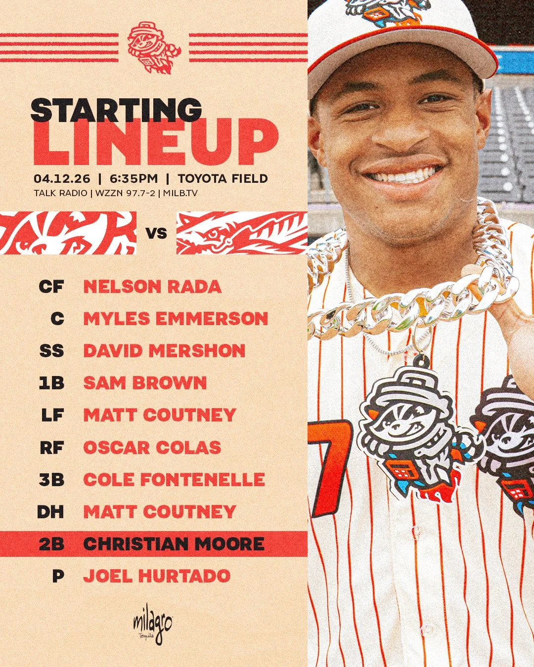
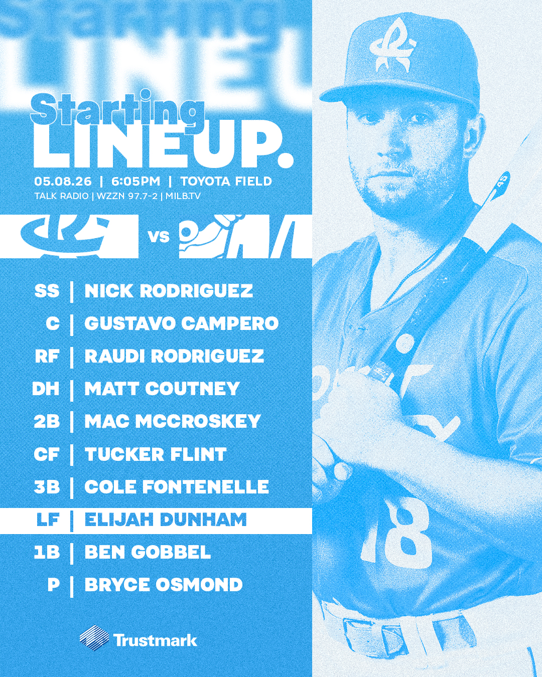
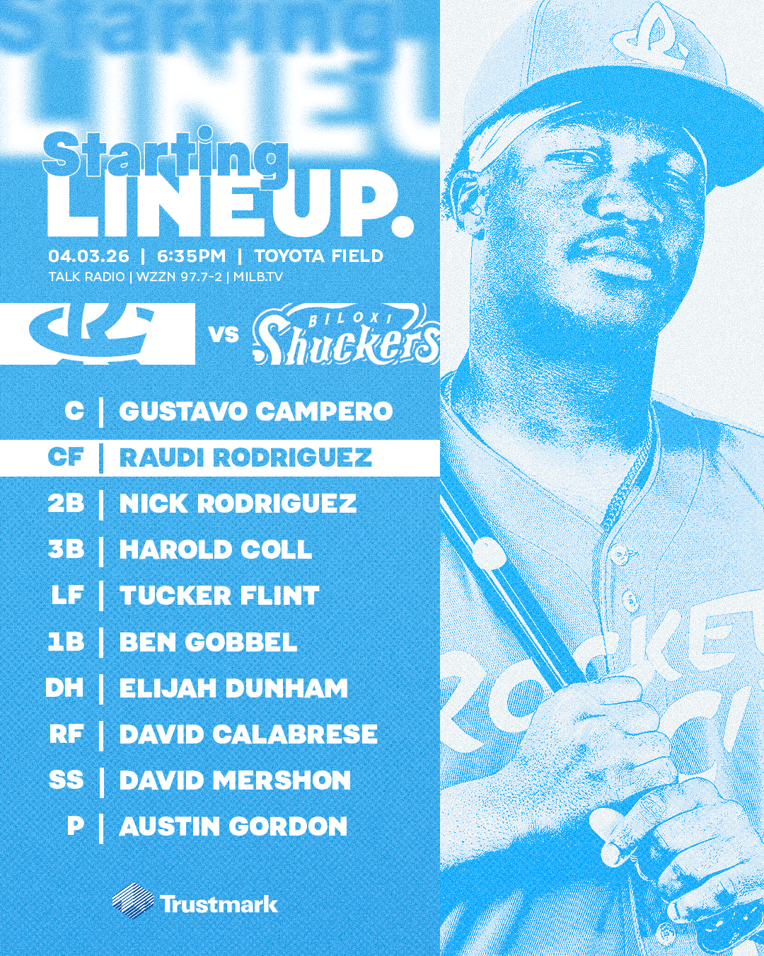
Starting Lineup Graphics
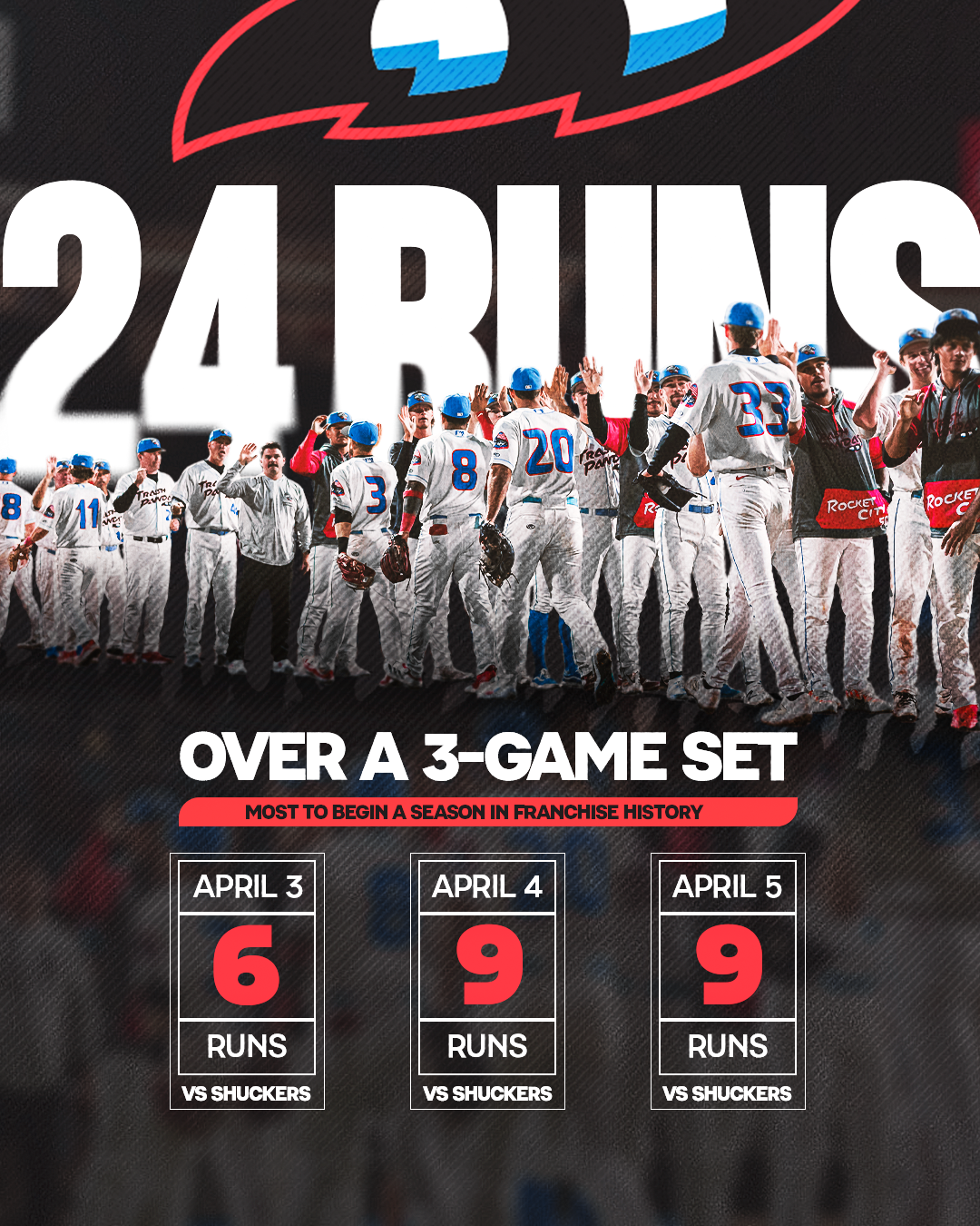
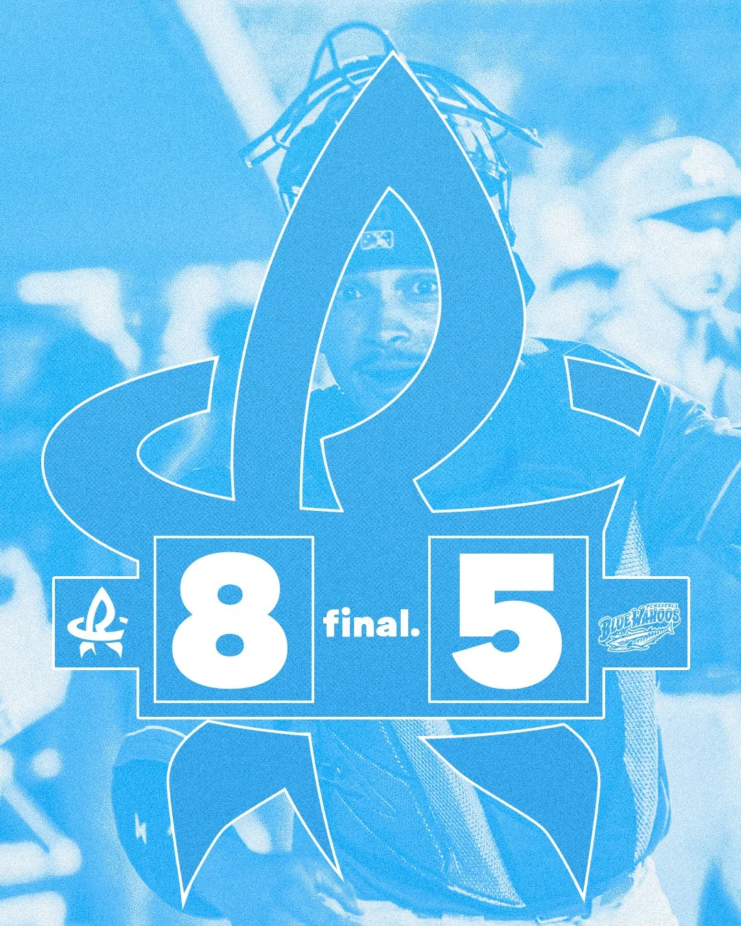
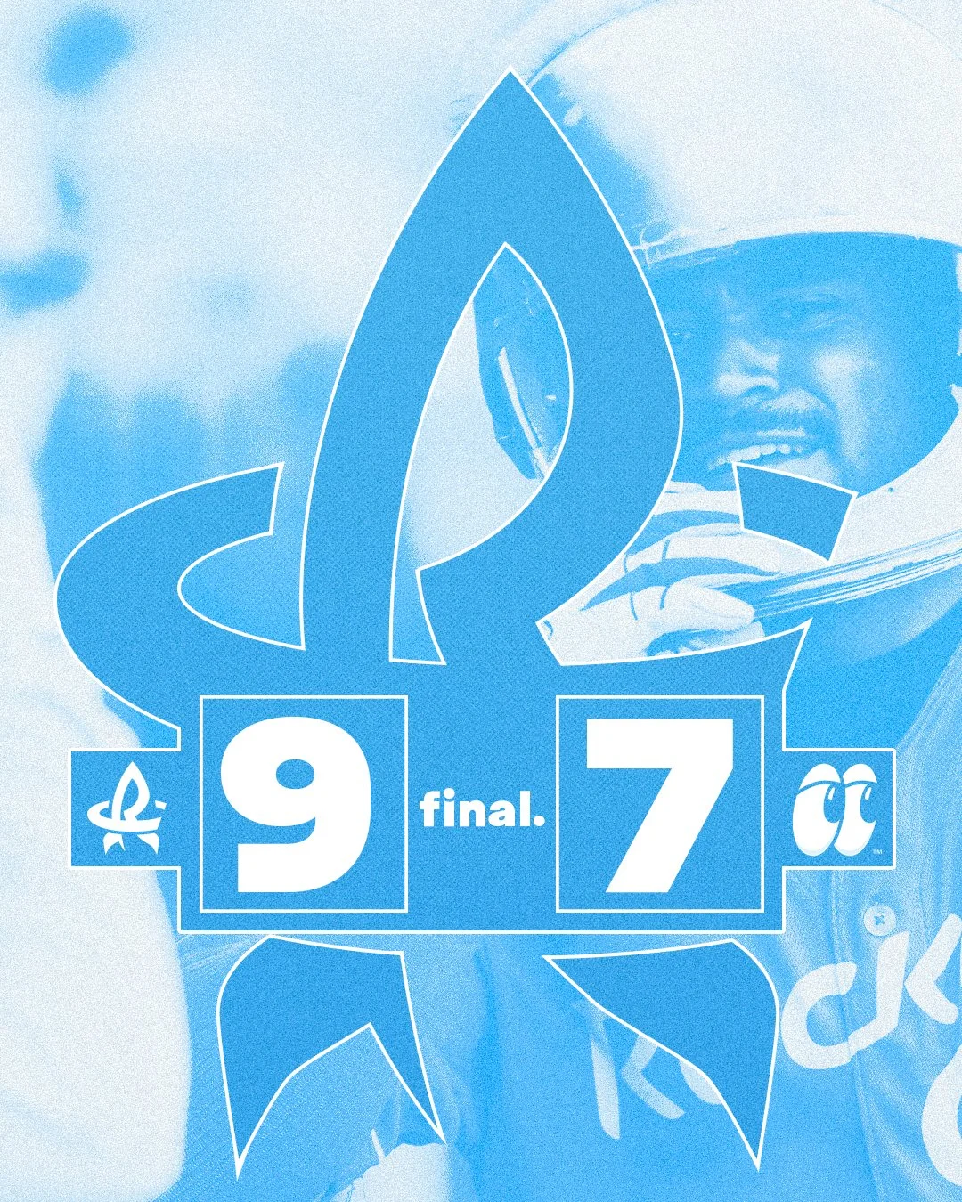
Win Graphics


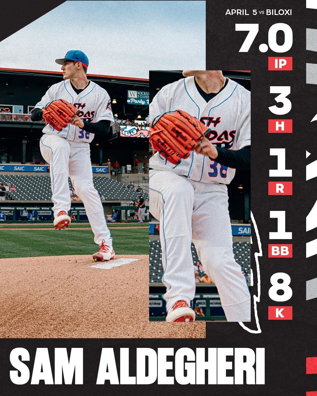
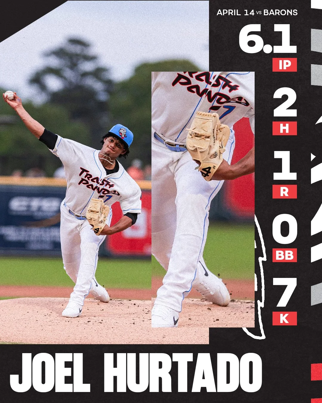
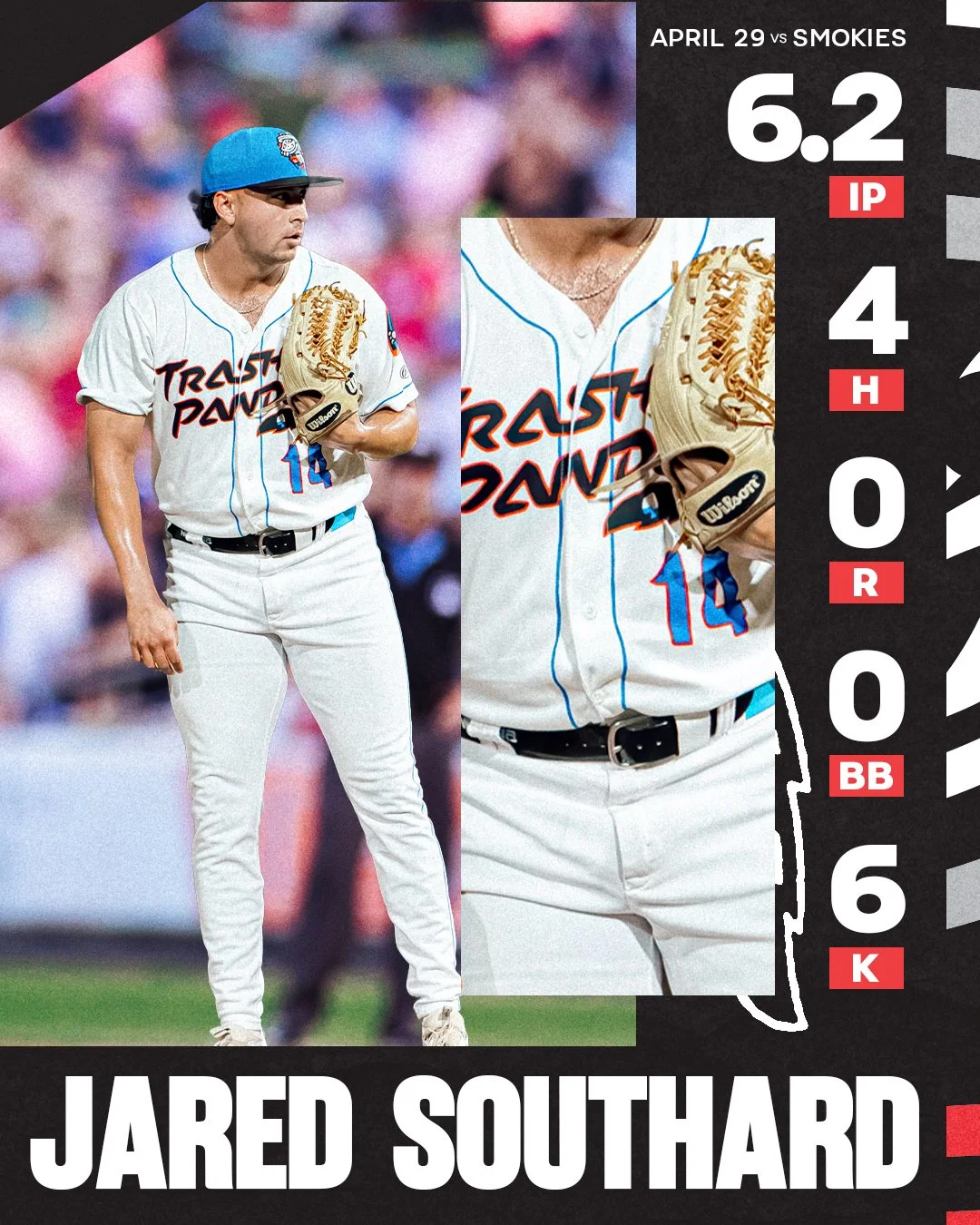
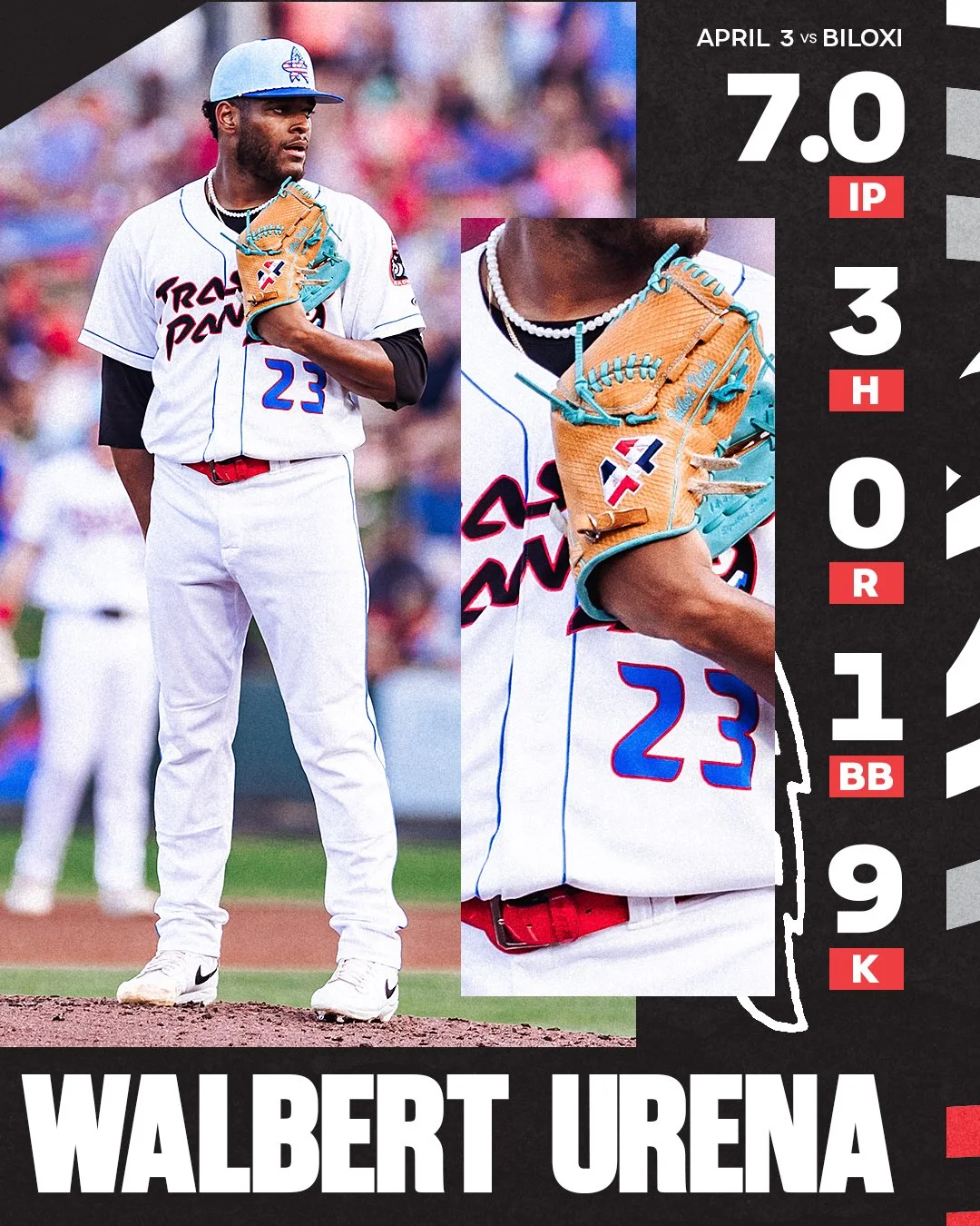
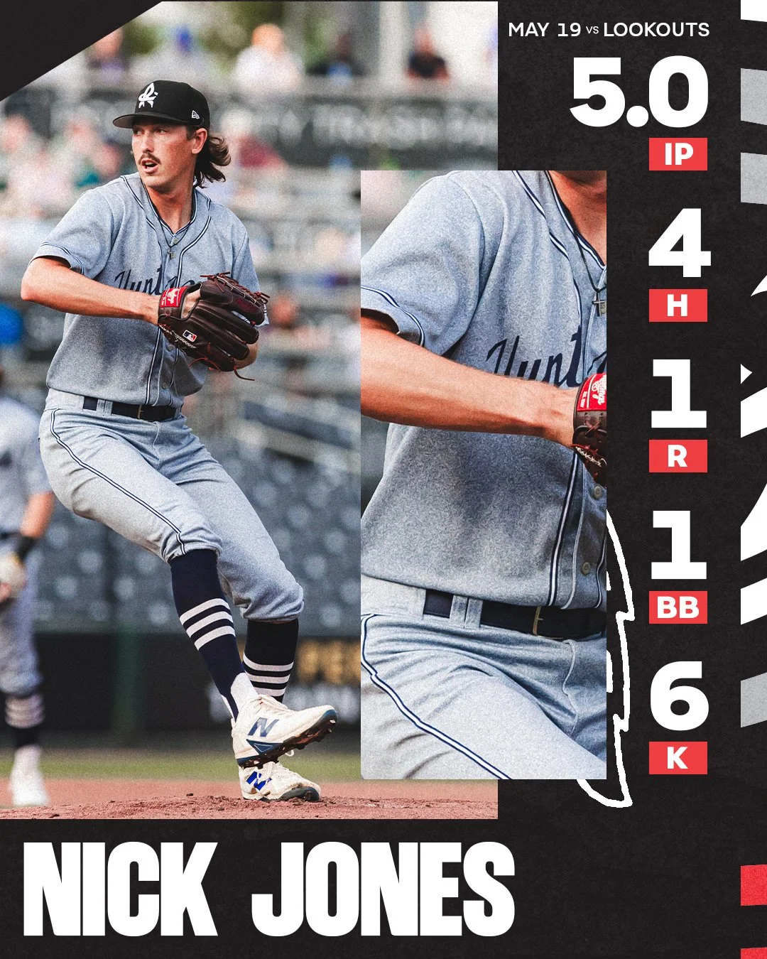
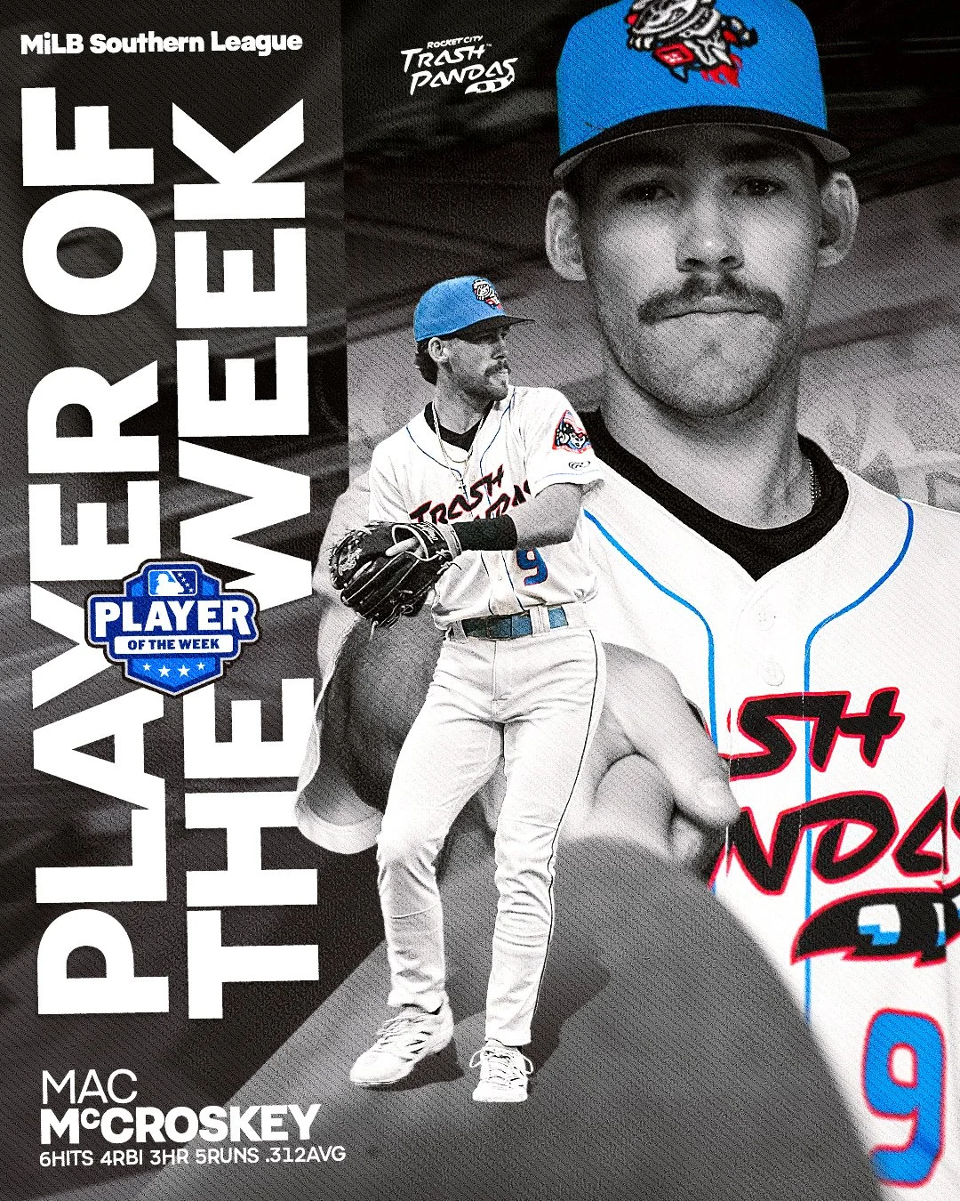
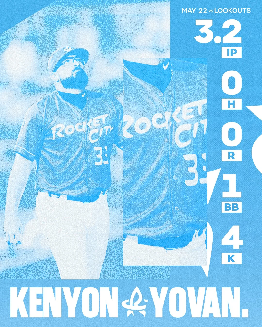
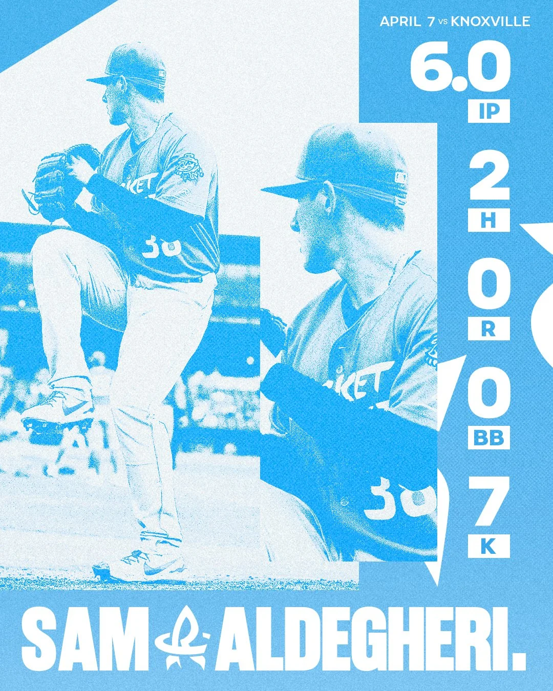
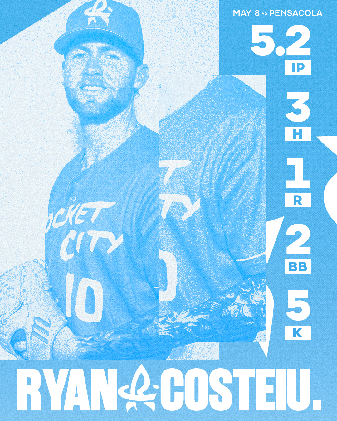
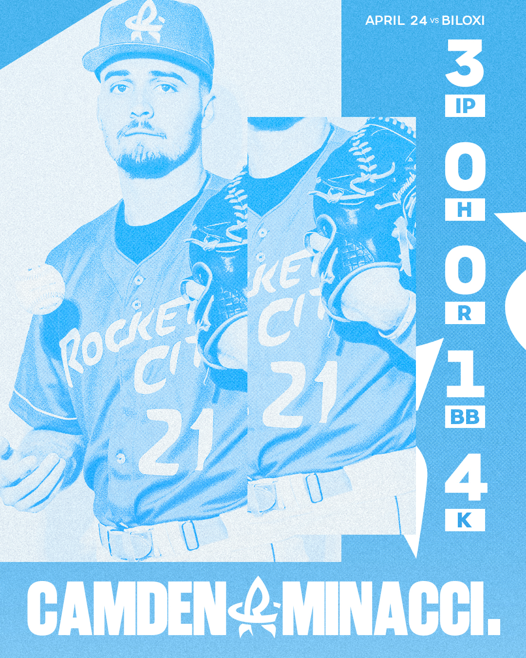
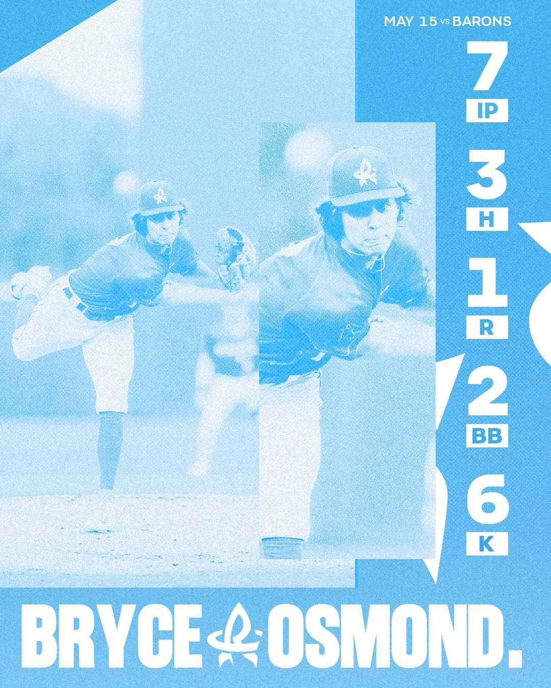
Pitching Performance Graphics

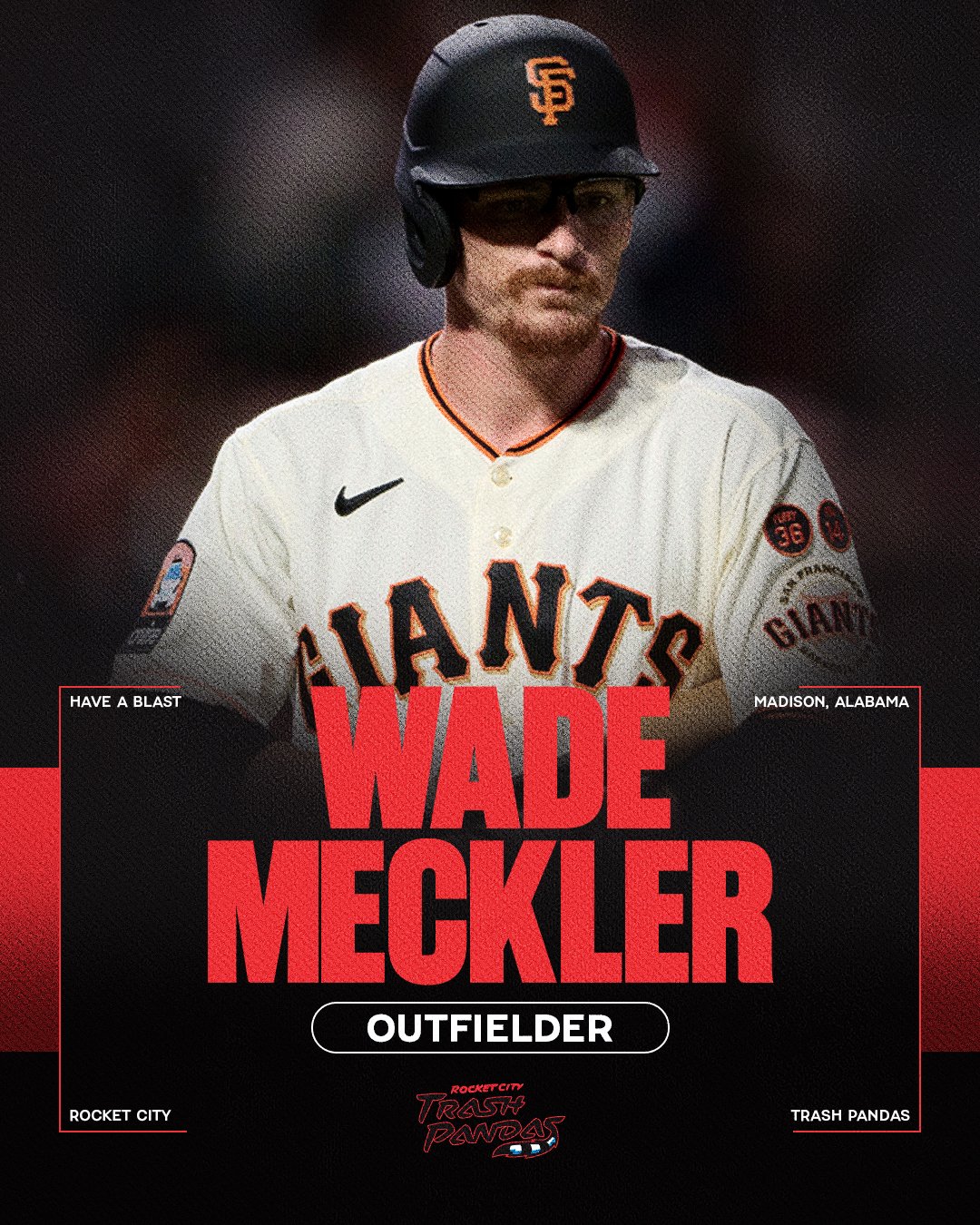
Team Welcome Graphics


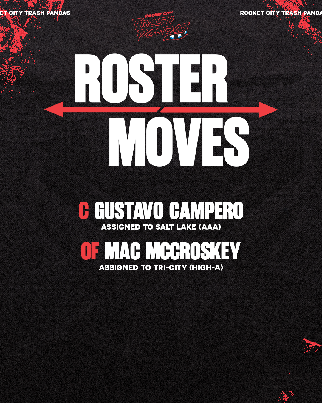
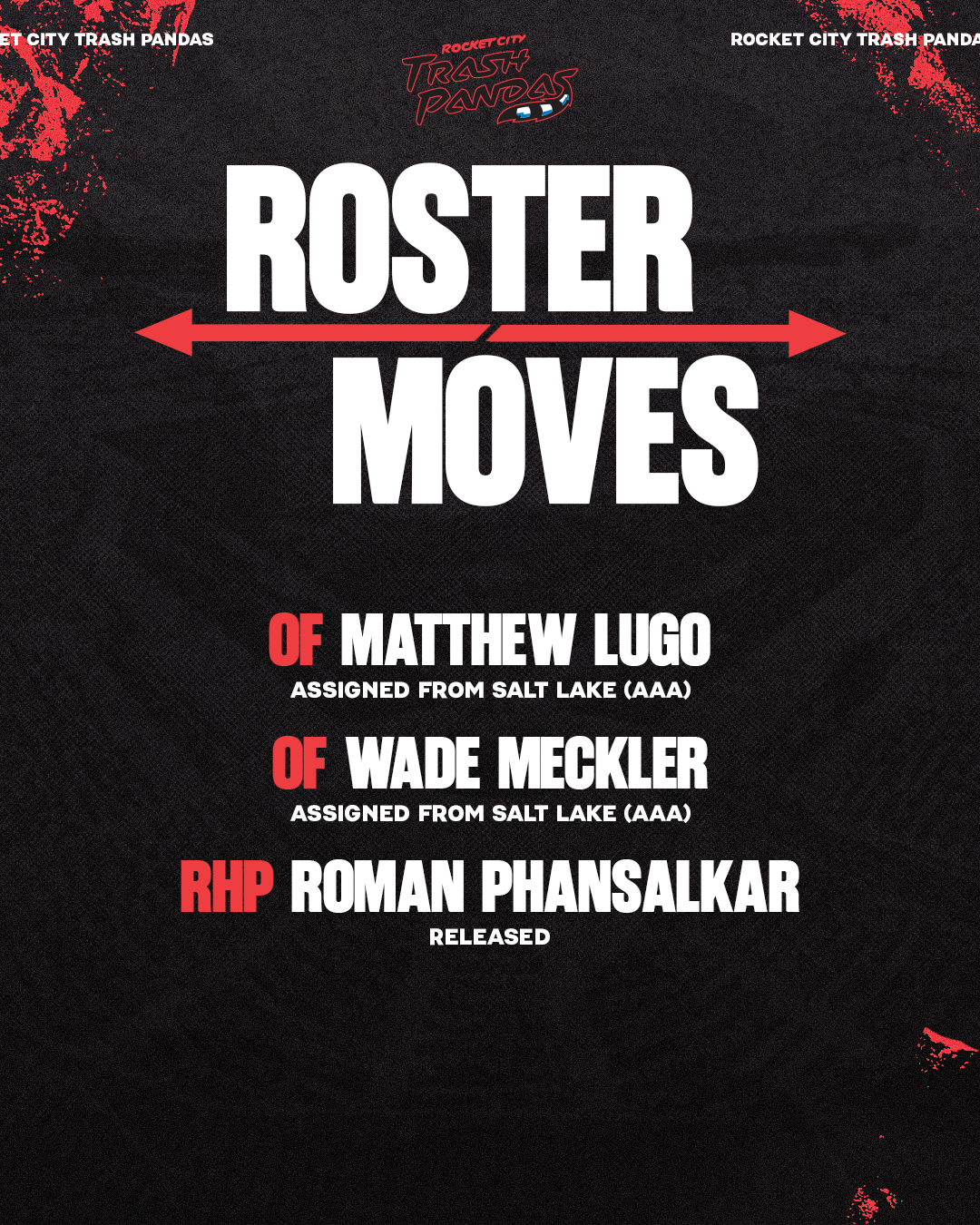
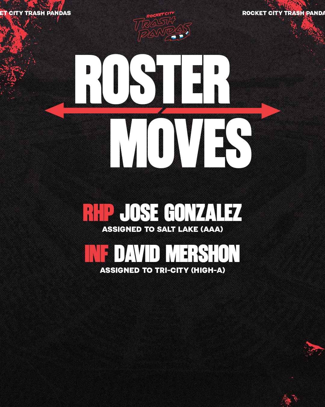
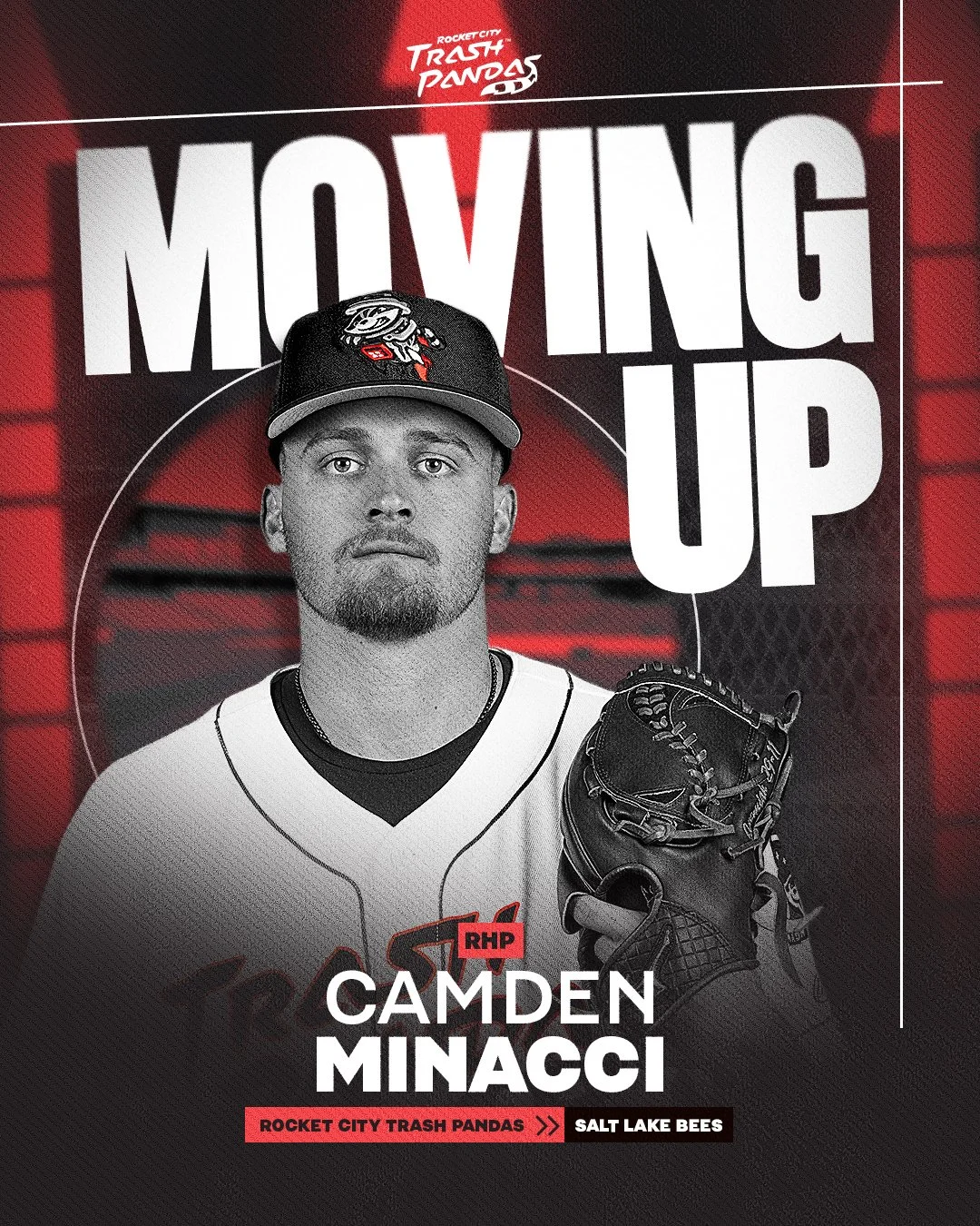
Roster Moves Graphics
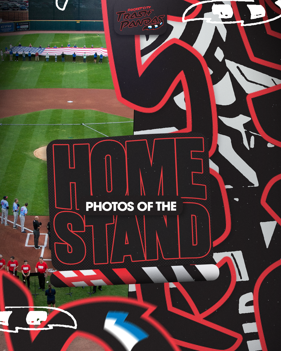
Photos of the Homestand Graphics


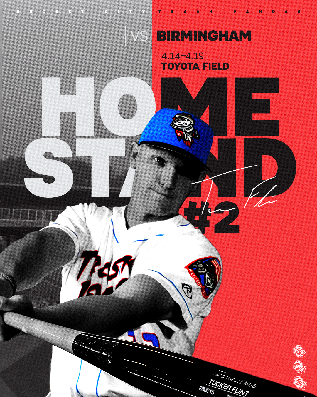
Homestand Graphics

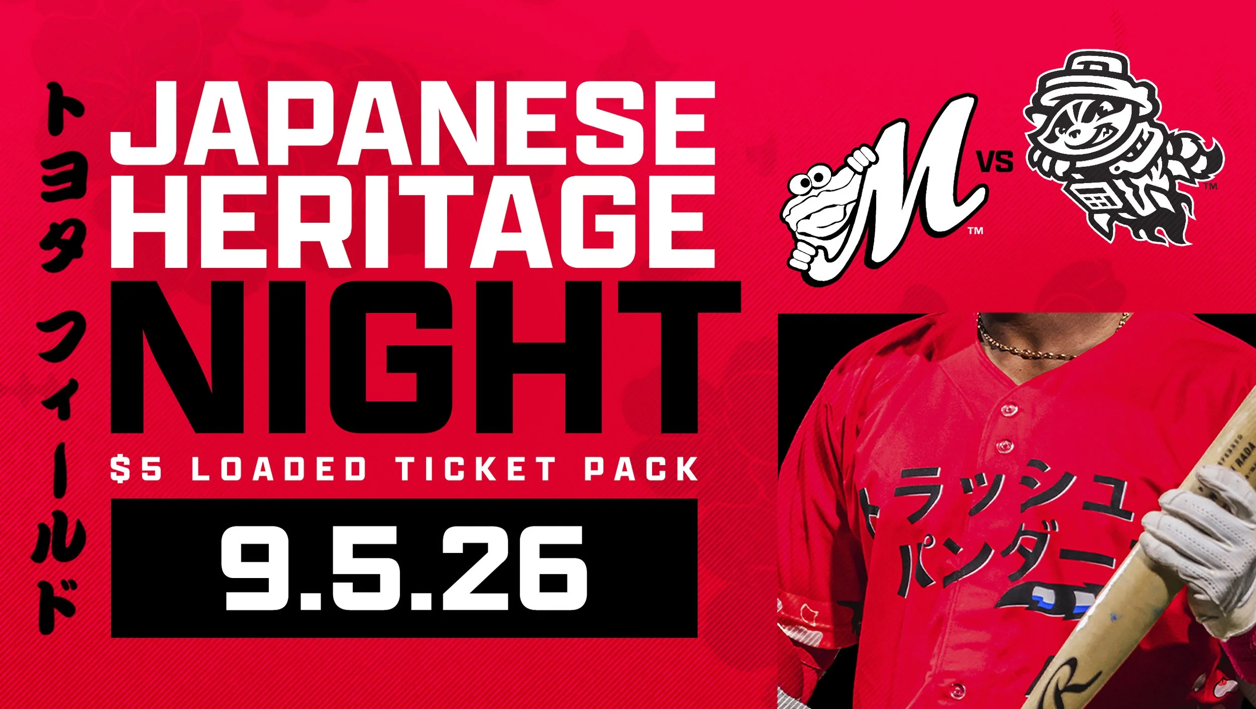
Miscellaneous Social Templates/Graphics
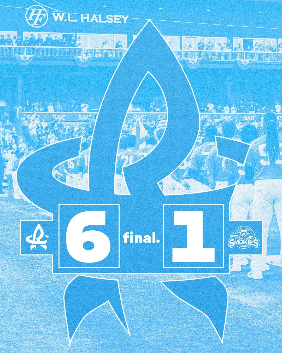
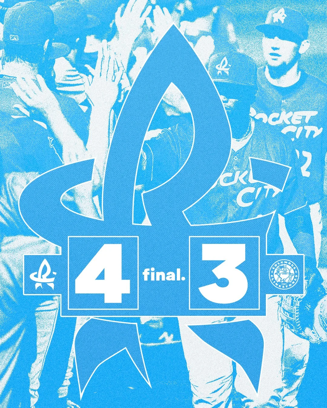
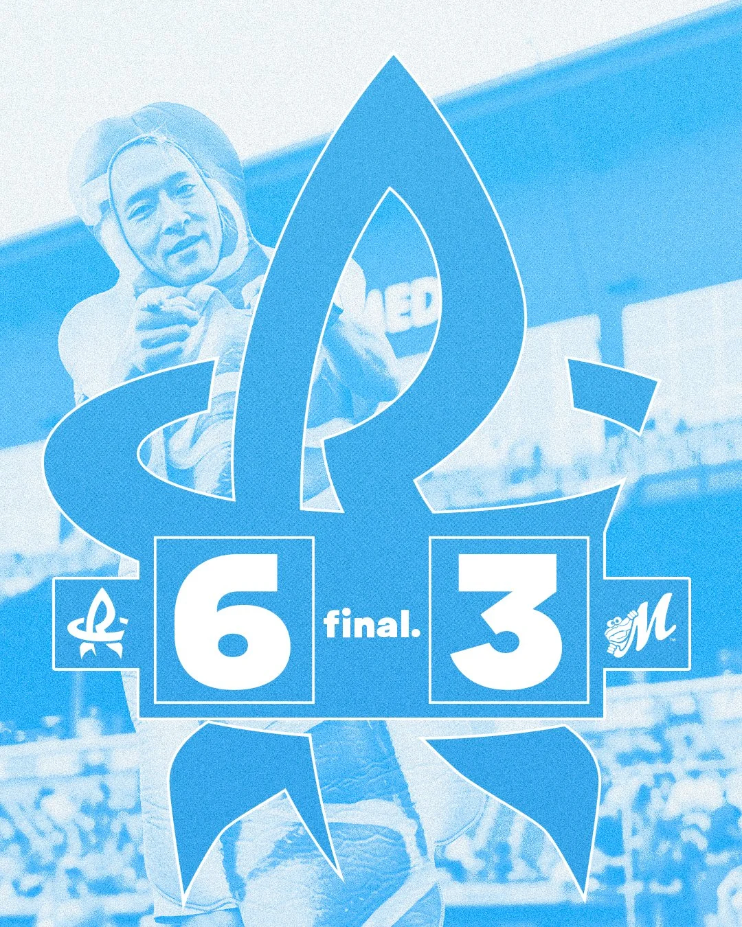
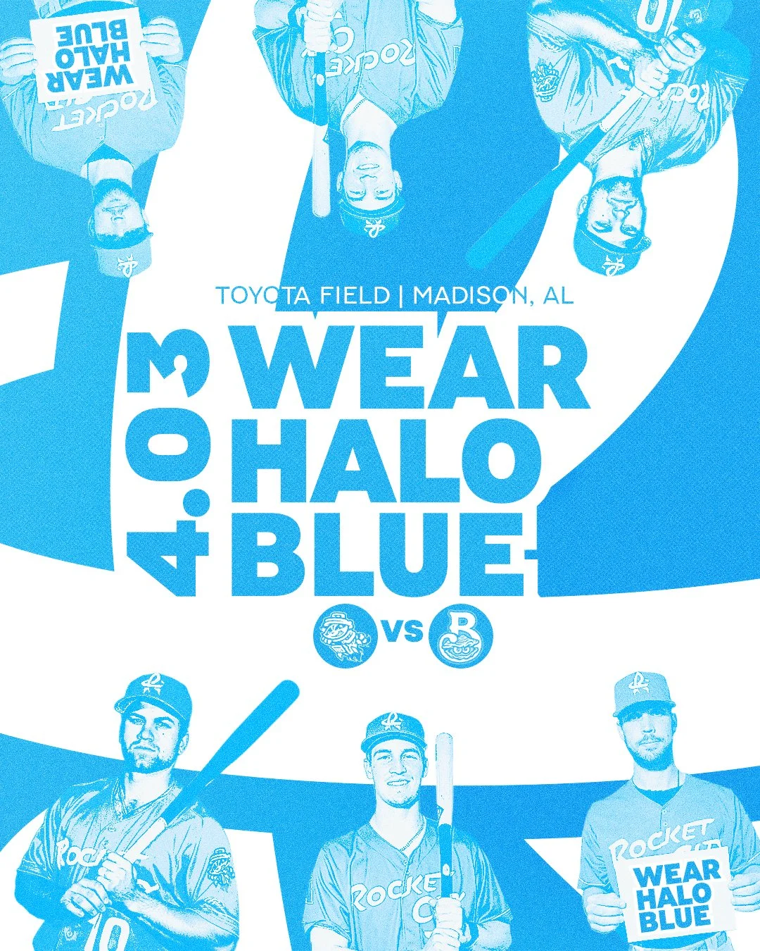
Halo Blue Social Templates
Win Graphics

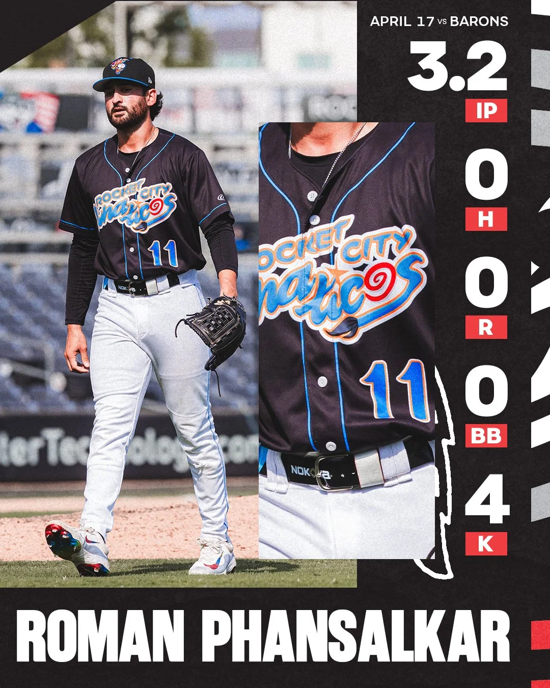
Pitching Performance Graphics


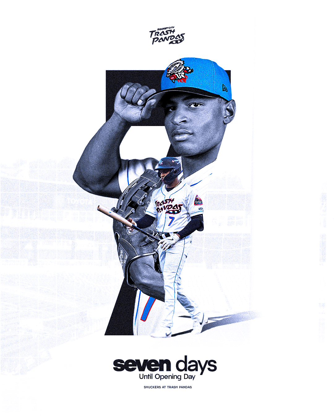
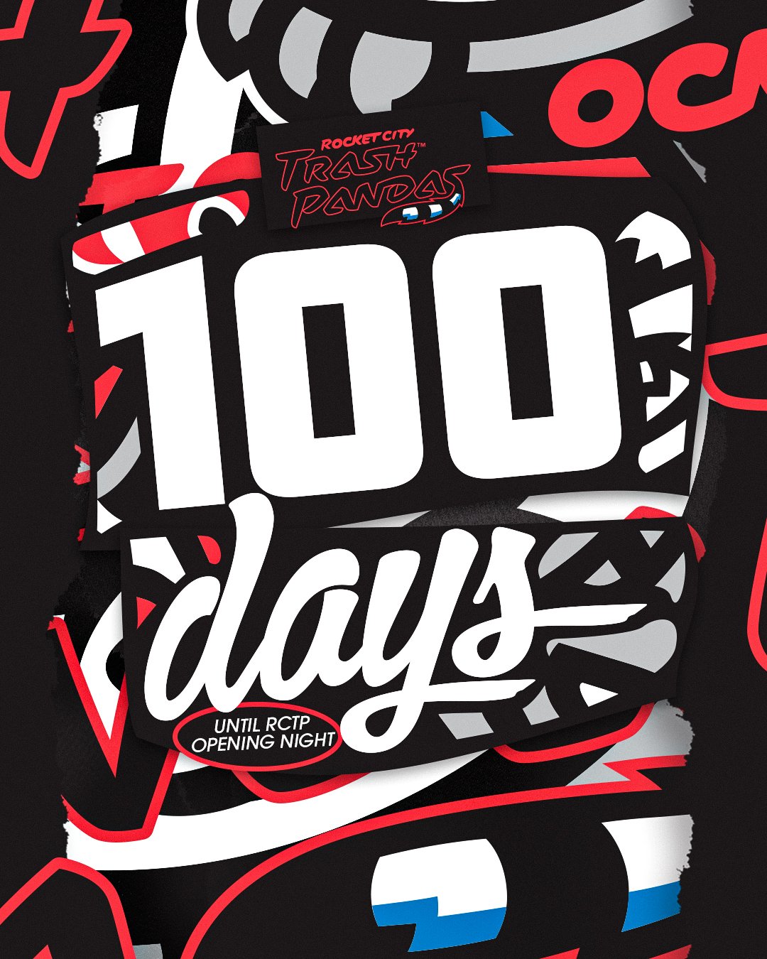
Season Countdown Graphics


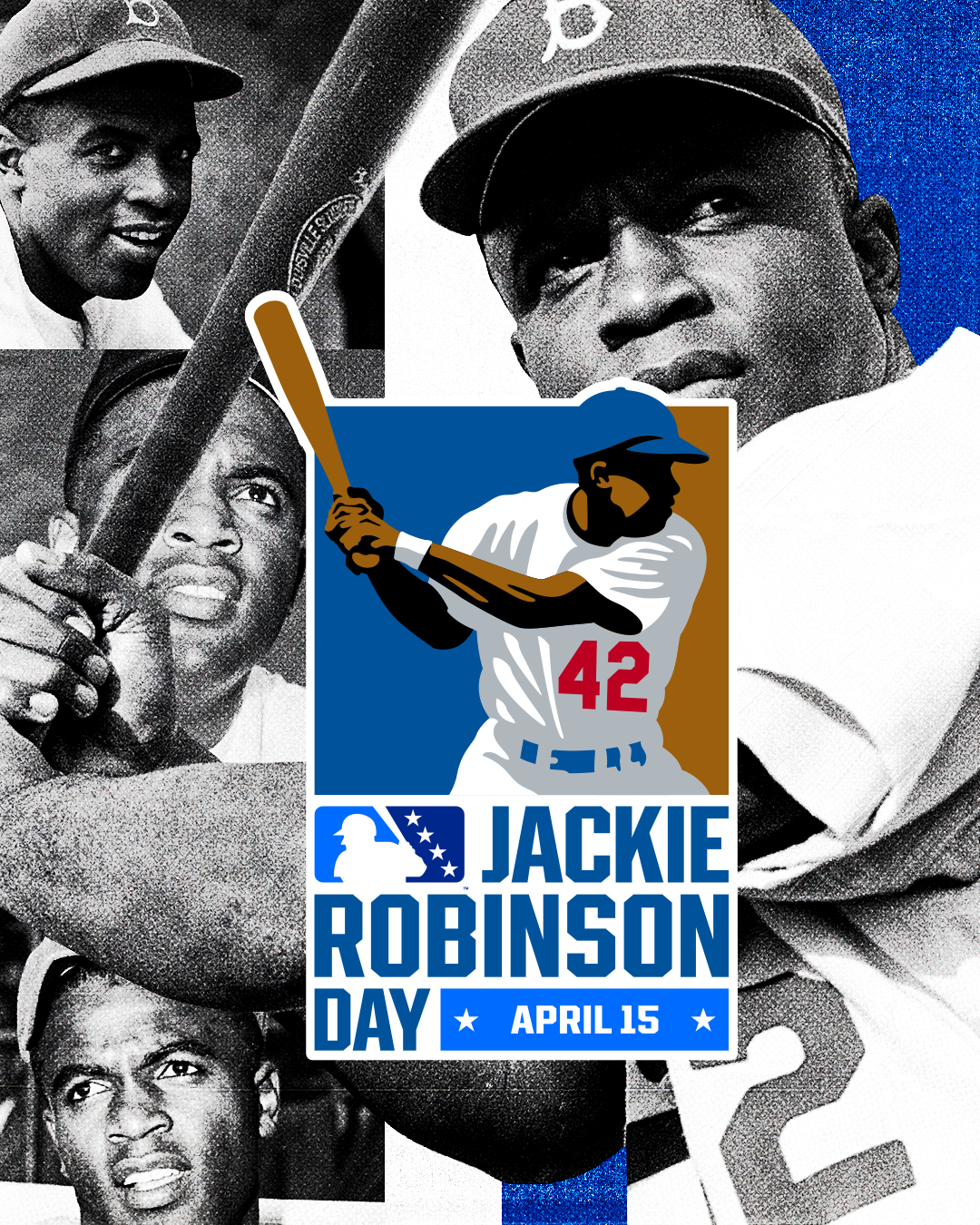
Throwback Thursday Social Templates

Starting Lineup Graphics
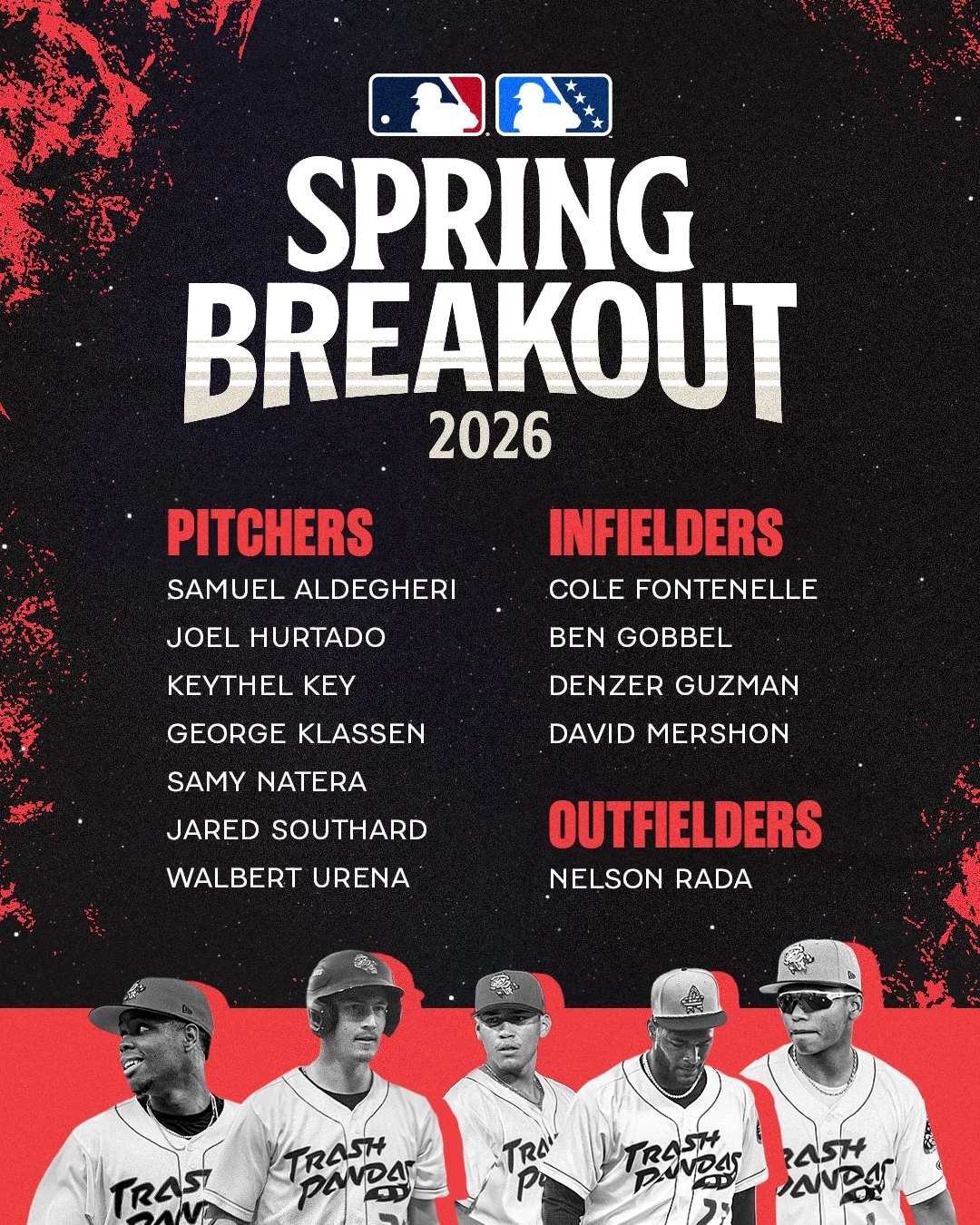
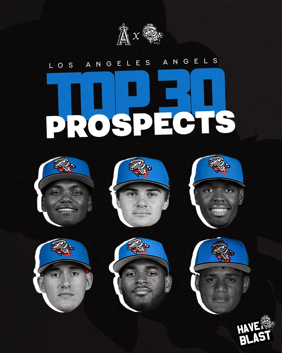
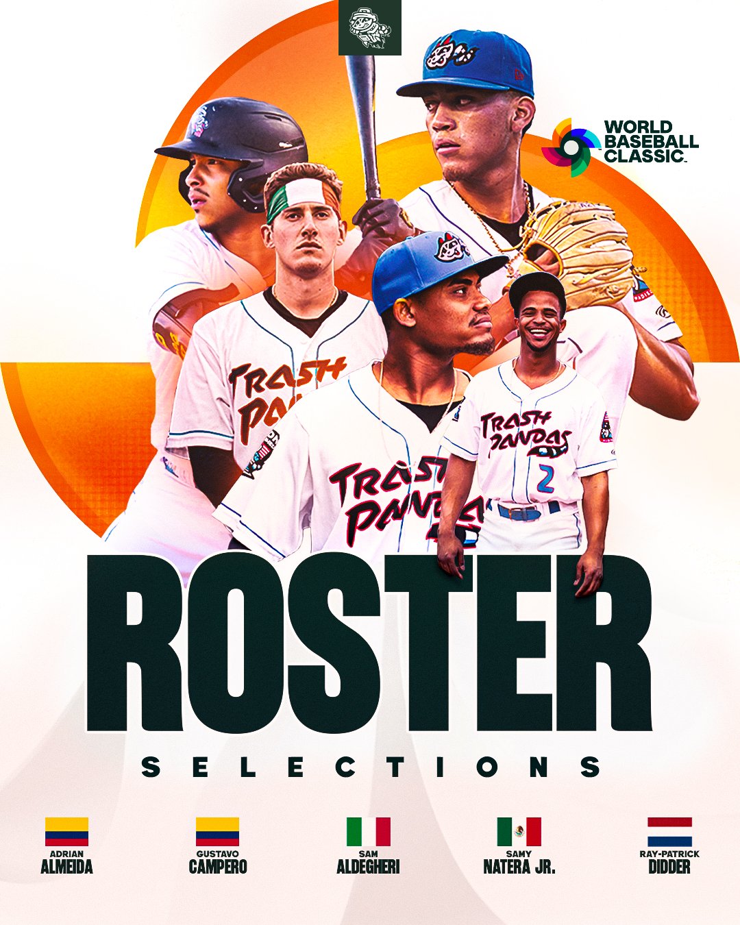
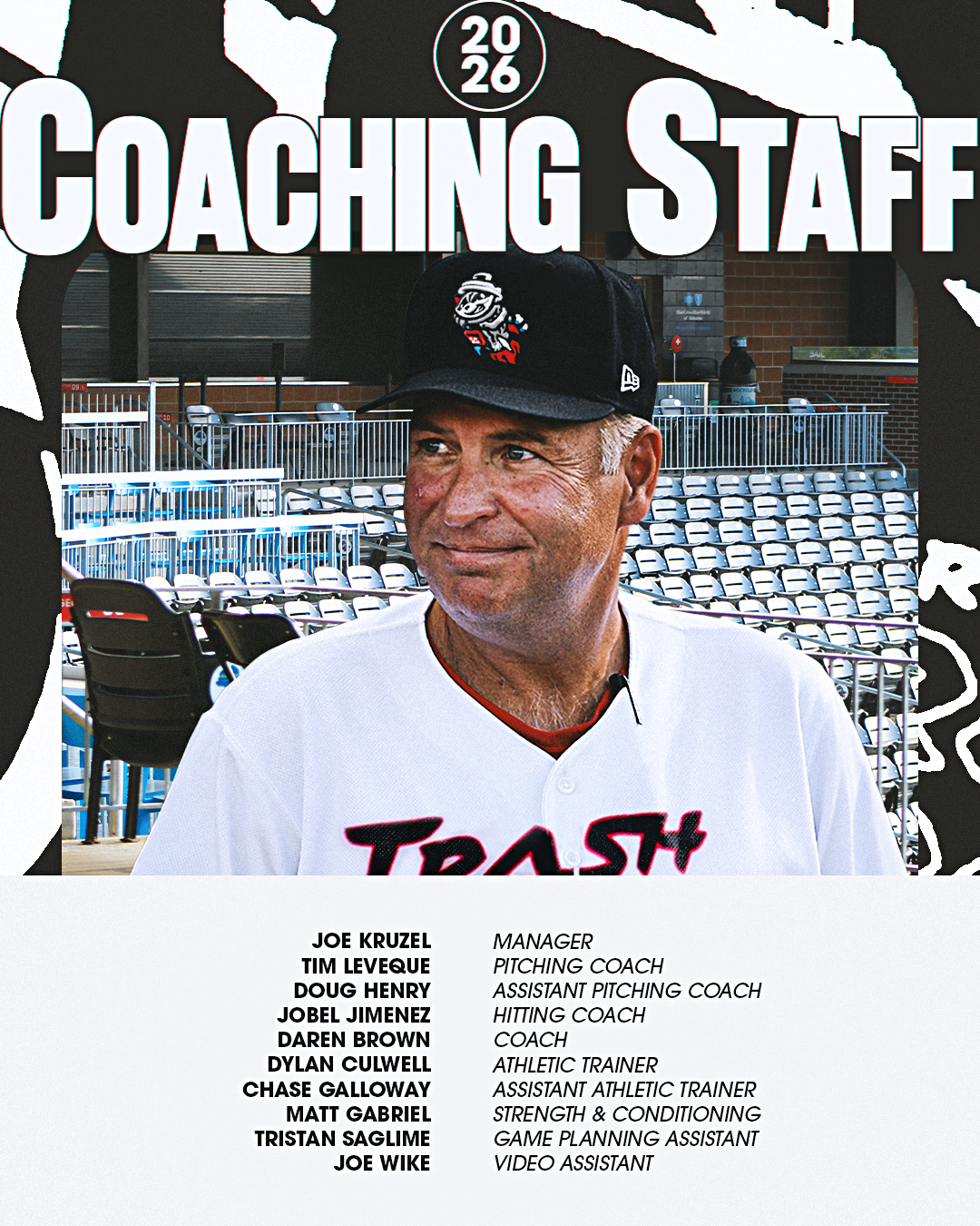
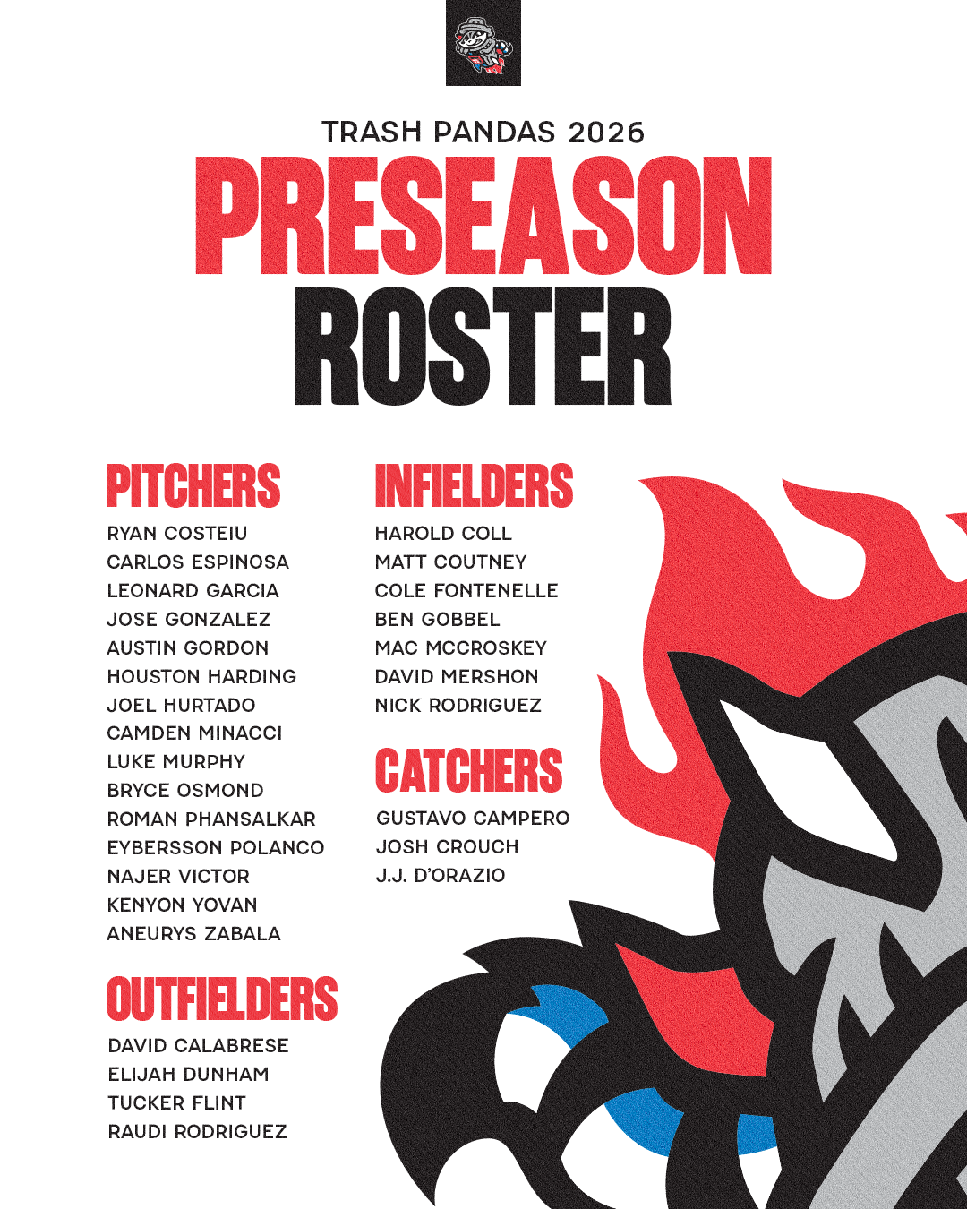
Preseason Content

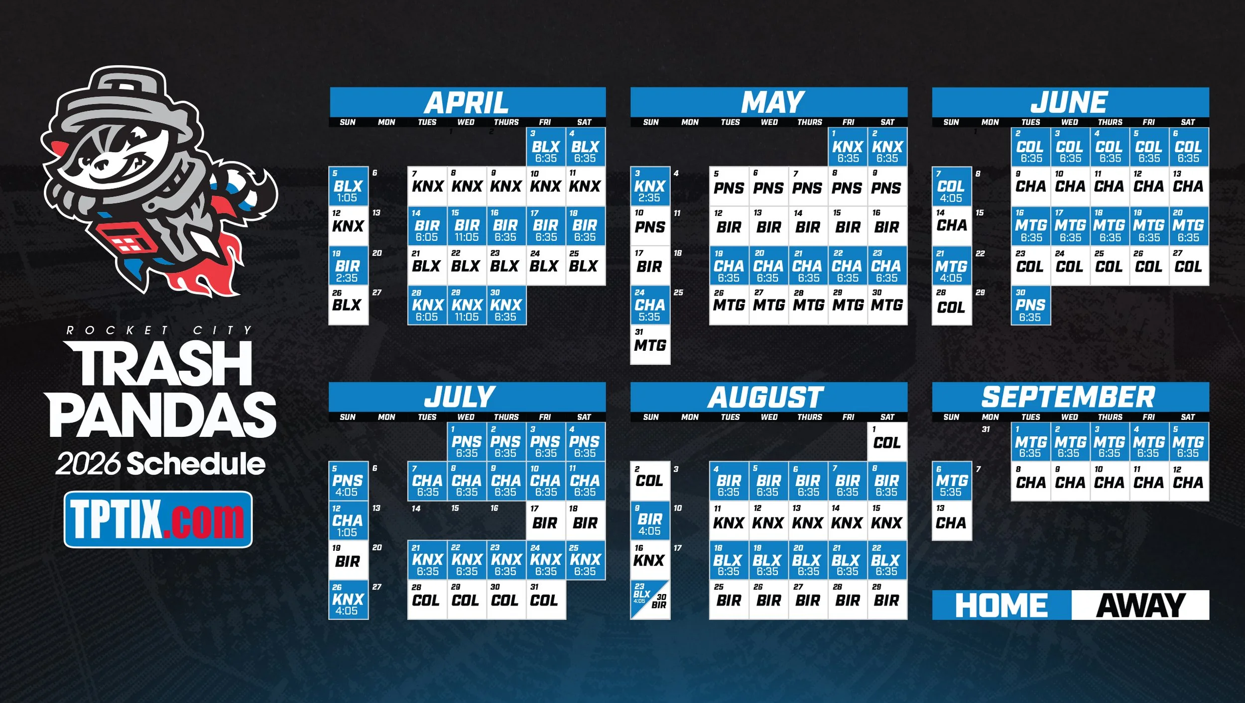
Website Graphics


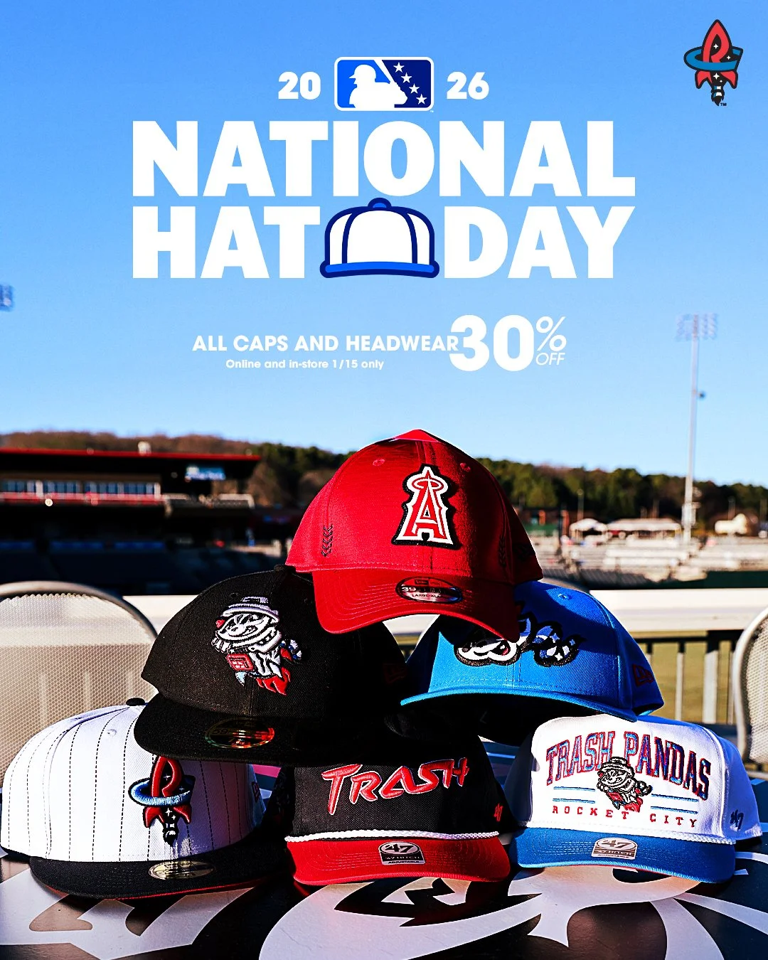
Shop & Promotional Deliverables